





Creating a calm and inviting atmosphere in your home starts with the colors you choose. Colors have a powerful impact on our mood and the overall feel of a space. When you select calm colors, you promote relaxation, reduce stress, and make your home a peaceful retreat.
If you’re thinking about refreshing your walls or decorating with a tranquil palette, this guide will help you make thoughtful choices. Below are tips to help you pick calm colors that suit your style and create a serene environment.
Understanding Calm Colors
Calm colors are typically soft, muted hues that offer a sense of peace and balance. These colors are neither too bright nor overwhelming, making them perfect for spaces where you want to unwind.
Some common calm color families include:
– Soft blues: Evoke the feeling of water and sky, promoting tranquility.
– Muted greens: Remind us of nature and provide a refreshing yet restful vibe.
– Warm neutrals: Such as beige, taupe, and soft grays, which create a cozy, grounded atmosphere.
– Pale lavenders or blush pinks: Gentle tones that add warmth without overpowering.
Tips for Choosing Calm Colors
1. Consider the Room’s Purpose
Different rooms have different energy needs. For example:
– Bedrooms: Ideal for colors that promote sleep and rest, like soft blues, greens, or muted lavenders.
– Living rooms: Can feature warm neutrals or gentle blues that encourage relaxation and conversation.
– Bathrooms: Light blues or seafoam greens work well to create a spa-like feel.
– Workspaces: Opt for subdued greens or blues to help concentration without creating too much energy.
2. Test Paint Samples in Your Space
Lighting plays a big role in how colors look. Natural light changes throughout the day and artificial lights can alter the shade as well.
– Paint small sections on different walls.
– Observe the colors in morning, afternoon, and evening light.
– Consider how the color affects the room’s mood at different times.
3. Use Color Palettes and Inspiration Boards
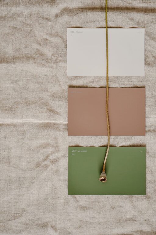
Before committing, create a color palette that combines your chosen calm colors with complementary shades.
– Use tools like online color palette generators.
– Gather fabric swatches, paint chips, and photos that inspire you.
– This approach helps ensure colors work well together and align with your style.
4. Stick to Muted and Soft Tones
Avoid overly bright or intense colors when aiming for calmness. Instead, choose shades with higher gray or white content to soften the hue.
– For example, instead of a bright turquoise, consider a dusty teal.
– Instead of a bright yellow, try a pale buttery tone.
5. Balance Warm and Cool Tones
Calm colors can be warm (like beige or blush) or cool (like blue or gray). Mixing both helps create depth without overwhelming the senses.
– Pair a cool, soft blue with warm beige accents.
– Use green with hints of gray to strike a balanced mood.
6. Coordinate with Your Existing Decor
Make sure the colors you choose complement your furniture, flooring, and decorative items.
– Neutral furniture typically pairs well with a variety of calm colors.
– Wood tones usually bring warmth, so cooler wall colors can provide nice contrast.
– Consider how textiles like curtains and cushions will fit into the palette.
7. Use Color Psychology Mindfully
While personal preference is important, it’s helpful to understand basic color psychology:
– Blue: Calm, trust, serenity.
– Green: Nature, balance, renewal.
– Lavender: Peace, creativity, calmness.
– Beige/Gray: Stability, simplicity, comfort.
Use these associations as a guide to reinforce the atmosphere you want.
8. Don’t Forget Accent Colors
Even in calm spaces, a pop of color can add interest without disturbing the peaceful feel.
– Use soft accent colors like muted coral, sage green, or dusty pink in pillows, artwork, or rugs.
– Keep accents subtle and limited to avoid distraction.
Practical Steps to Apply Calm Colors
Step 1: Start with a Neutral Base
Neutral walls provide a versatile backdrop and allow you to change accent colors easily over time.
Step 2: Add Layers of Color Through Textiles and Accessories
Soft throws, cushions, and curtains in calm colors bring texture and richness.
Step 3: Use Natural Materials
Wood, stone, and plants enhance calm colors by connecting the indoors to nature.
Step 4: Maintain Consistency Across Spaces
Choosing a consistent palette throughout the home keeps the overall mood harmonious and uncluttered.
Final Thoughts
Choosing calm colors doesn’t have to be complicated. Focus on soft, muted tones that reflect your style and create the peaceful environment you want. Take your time testing colors and let your home’s natural light guide you. With patience and planning, your space can become a soothing retreat from everyday stress.
Remember, the best calm color for your home is the one that makes you feel relaxed and happy. Enjoy the process of creating a tranquil space that truly feels like your own.